Chart

As explain in the section on working with data and Reports, the <Chart> component supports report objects and bookmark IDs directly.

But when you create your own Insight or Plugin, you sometimes need to map your own data results to the JSON format that is understood by the <Chart> component.

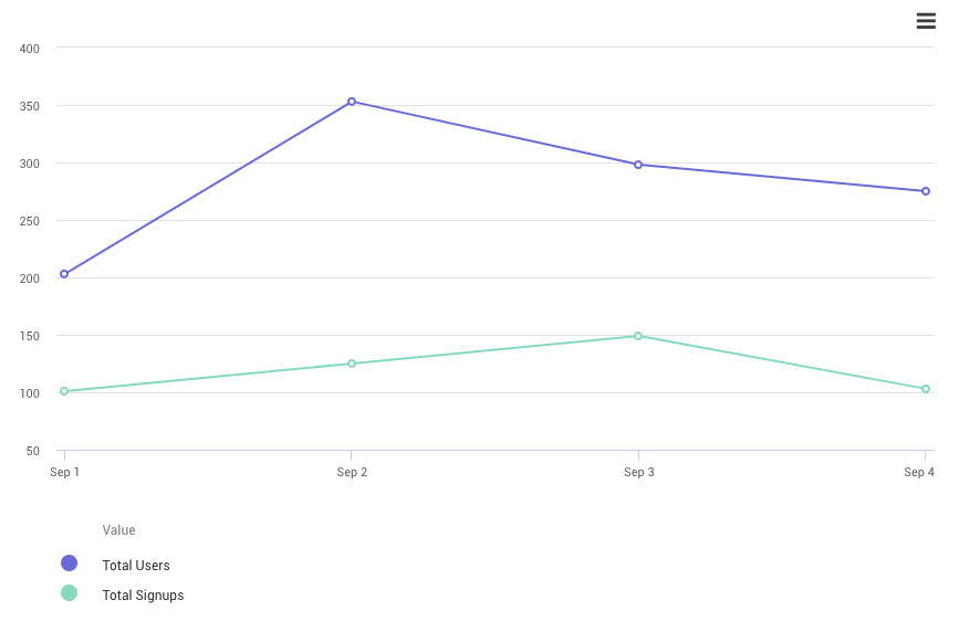
Each JSON chart object consists of two sections — the context and the data. A minimal chart object for a line chart looks like this:

js code:
const chart = {
"context": {
"dateRanges": [
"Last 7 days: 1 Sept - 4 Sept"
],
"timeUnit": "day",
"type": "line",
"values": [
"Total Users",
"Total Signups"
]
},
"data": [
{
"dateRange": 0,
"time": "2020-09-01T00:00:00Z",
"values": [203, 101]
},
{
"dateRange": 0,
"time": "2020-09-02T00:00:00Z",
"values": [353, 125]
},
{
"dateRange": 0,
"time": "2020-09-03T00:00:00Z",
"values": [298, 149]
},
{
"dateRange": 0,
"time": "2020-09-04T00:00:00Z",
"values": [275, 103]
}
]
};
return {chart};
jsx code:
<Insight>
<Chart data={data.chart} />
</Insight>
This is displayed by the chart as:

Minimal Chart

The data supplied to <Chart data={...}> can be either an array of chart object(s), or a single chart object.
When supplying an array with multiple chart objects, it allows the end-user to quickly switch between chart visualizations and data presentations using a dropdown list in the title, but you're then required need to provide a title in the context of each chart data object in the array. You can also supply an array with one chart object.

Example using multiple chart objects:
const chart = [
{
"context": {
"dateRanges": [
"Last 7 days: 1 Sept - 4 Sept"
],
"timeUnit": "day",
"type": "line",
"values": [
"Total Users",
"Total Signups"
]
},
"data": [...]
},
{
"context": {
"dateRanges": [
"Last 4 weeks: 1 Aug - 1 Sept"
],
"timeUnit": "week",
"type": "line",
"values": [
"Total Users",
"Total Signups"
]
},
"data": [...]
},
];
return {chart};

Note that you can mix different chart types each with its own context and data — for example one bar chart for funnel conversion steps, then a line chart for conversion over time.

Context object

Line charts

{ "context": { "timeUnit": "total", "timeBy": "Created at date and time", "dateRanges": [ "Average Week" ], "segments": [

],
"groupBy": [
],
"types": {
"groupBy": [
],
"values": [
"number"
]
},
"dataFormat": "timeseries",
"values": [
"Tuesday",
"Wednesday",
"Thursday",
"Friday",
"Saturday",
"Sunday",
"Monday"
],
"type": "bar",
"verticalLabel": "Increase",
"formatValues": {
"display": "percentage",
"decimals": 2
},
"icon": "hashtag",
"title": "Day-of-week effect"
},
"data": [
{
"dateRange": 0,
"time": null,
"values": [
0.07954427633817177,
0.11216720718065473,
0.09389628082632707,
0.014800699550791304,
-0.10062874363383871,
-0.19534760349659577,
-0.0044321167653766985
]
}
]

},

Bar charts

Overriding data context with props

Most options that can be set in the context of the data object itself, can also be supplied directly to the <Chart> component as a prop.

Any properties given to <Chart> directly override any same ones from the data context. This so you can easily change axis labels, formatting and such, without having to change the data context object.

For example:

<Chart
title="Revenue forecast"
verticalLabel="Revenue in $"
values={["Lower Range", "Forecast", "Upper Range"]}
ranges={{lower: 0, middle: 1, upper: 2}}
/>

This would be the same as if specified in the data context like this:

{
"context": {
"title": "Revenue forecast",
"verticalLabel": "Revenue in $",
"values": [
"Lower Range",
"Forecast",
"Upper Range"
],
"ranges": {
"lower": 0,
"middle": 1,
"upper": 2
},
"type": "line",
"timeUnit": "day",
"dateRanges": ["Jan 17, 2020 - Jul 16, 2020"]
},
"data": [
...
]
}

Upper and lower range bands

When you have a line chart, you can add a lower and upper band. For this to work properly, your data object needs to have exactly three values. By supplying the data context or chart property ranges, which is an object indicating which array indexes from values are the lower, middle and upper bands:
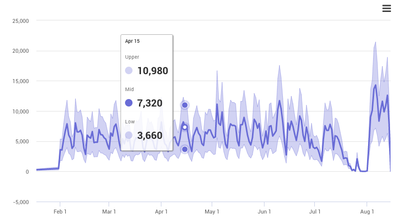
<Chart
data={reportData}
ranges={{lower: 0, middle: 1, upper: 2}}
values={["Lower Range", "Actual Value", "Upper Range"]}
/>

Line Chart Bands

note

Range bands only work for line charts, with exactly one date range, without any group by or segments. The chart data should also have exactly three values — more or less than three values will not work.

Because a custom SQL query with certain column names mapped can be used with a <Chart> directly, you can use range bands here as well:

const reportObject = new Report({
"sql": "SELECT max(date_trunc('day', FROM_UNIXTIME(events.created_at))) as \"time_day event creation date\", COUNT(events.id) as \"lineval1 Value 1\", COUNT(events.id)*2 as \"lineval2 Value 2\", COUNT(events.id)*3 as \"lineval3 Value 3\" FROM events GROUP BY date_trunc('day', FROM_UNIXTIME(events.created_at))"
});
const reportData = await ReportData.get(reportObject);
return {reportData};
<Chart
data={data.reportData}
ranges={{lower: 0, middle: 1, upper: 2}}
values={["Lower Range", "Actual Value", "Upper Range"]}
/>

Custom chart visualizations

The <Chart> component currectly only supports line and bar charts. While this is enough in most cases, and we will add support for more chart types in the near future.

Because the <Chart> component is based on Highcharts, it allows you to construct any custom Highcharts compatible chart supplying a Highcharts options object directly as the raw property of the chart component:

<Chart raw={highChartOptionsObject} />

See the Highcharts examples page for an overview of all different chart visualizations.

Below an example of an Insight that creates a custom scatter plot and sankey diagram:

Custom Charts

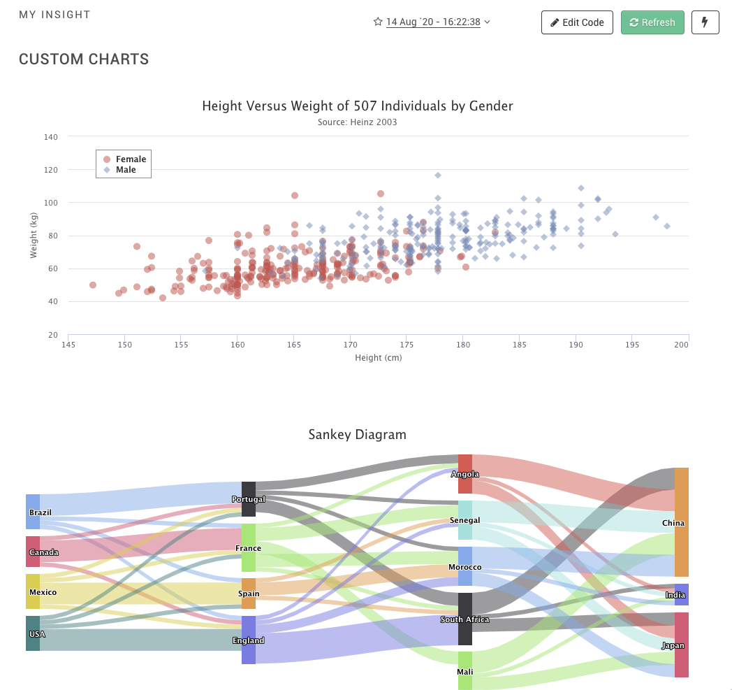
Here is how the code would look like, where scatter and sankey are taken directly from the options object as used in the Highcharts examples:

const colors = Highcharts.getOptions().colors;
const scatter = {
chart: {
type: 'scatter',
zoomType: 'xy'
},
title: {
text: 'Height Versus Weight of 507 Individuals by Gender'
},
subtitle: {
text: 'Source: Heinz 2003'
},
xAxis: {...},
yAxis: {...},
legend: {...},
series: [...]
};
const sankey = {
title: {
text: 'Sankey Diagram'
},
accessibility: {
point: {
valueDescriptionFormat: '{index}. {point.from} to {point.to}, {point.weight}.'
}
},
series: [...]
};
return {scatter, sankey};
<Insight title="My Insight">
<Title>Custom Charts</Title>
<Chart raw={data.scatter} />
<Chart raw={data.sankey} />
</Insight>

Misc

- Chart:
- Context:
- timeUnit: "hour"/"day"/"week"/"month"/"total"
- Data item:
- time: needs to be a ISO 8601 compatible format
- dateRange: 0 or anything else (needs to be set?)
- That for both line and bar types, if per "total", then the data item should be: {time: null, values: [...], ...} or no time key at all.
x Limitation: only 1 <Chart data="abcd"/>; otherwise concurrency issues (all charts same)
x <Chart data=../> support string or Report object directly.
x <Chart raw={...}/>, where we can supply directly the highcharts options object
x Ranges (NOTE: only for line-charts!). Basically only addition is "ranges" object
x LIMITATION: only for {type: "line"}, only works for 1 date range without any groupBy segments and only a 3 values: lower, middle, upper. Additional values will not work.
- Chart props only:
- visibleSeries (defaults to 5; how many series to initially show, the rest can be toggled by end-user. Set to higher to show more series)
- Overridable values (via props or context):
- verticalLabel
- horizontalLabel
- title (main chart title)
- If any of those above has null/not specified in context, then it's not shown. If context has it, but <Chart verticalLabel={false} horizontalLabel={false} title={false} />, then even if context has it, it's still not shown.
- These can be given a string value, in which case all elements get the same label, or if supplying an array, if one of the elements doesn't matches, it uses the original:
- E.g. orignal context can be: {..., values: ["a", "b", "c"]}
- If we supply <Chart values="x" /> we get: values: ["x", "x", "x"]
- If we supply <Chart values={["x"]} /> we get: values: ["x", "b", "c"]
Works for:
- dateRanges
- segments
- values
- groupBy
- Chart data value formatting:
context: {
formatValues: {
display: 'percentage'/'relative-time'/'number',
decimals: 3,
prefix: '$',
postfix: ' eur',
timeUnit: 'seconds' // Optionally used with relative-time, to interpret value as seconds, hours, etc. Defaults to seconds.,
asRatio: true // For 'percentage' only; defaults to true, and expects as value for 90.5% to be a float of 0.95. If false, you can use 90.5 instead.
}
}
- Same formatValues object can be passed to <Chart formatValues={..}/>, and it will override any data.context.formatValues
- Write that: <Chart/> only works with non-array values (formatting is always done via context), while <Table/> works only with array values for now.